Designing An App For Alternative Access Assessments: Using Prototypes And User Studies To Evaluate And Improve The Design
Heidi Koester![]() 1,4
1,4![]() , Susan Fager
, Susan Fager![]() 2,4
2,4![]() , Erik Jakobs
, Erik Jakobs![]() 3,4
3,4![]() , Tabatha Sorenson
, Tabatha Sorenson![]() 2,4
2,4![]()
![]() 1
1![]() Koester Performance Research, Asheville NC;
Koester Performance Research, Asheville NC; ![]() 2
2![]() Madonna Rehabilitation Hospital, Lincoln NE;
Madonna Rehabilitation Hospital, Lincoln NE; ![]() 3
3![]() Penn State University;
Penn State University; ![]() 4
4![]() Rehabilitation Engineering Research Center on Alternative and Augmentative Communication
Rehabilitation Engineering Research Center on Alternative and Augmentative Communication
INTRODUCTION
There are many alternative access methods, such as alternative keyboards or hands-free mice, that can enable people with motor impairments to access a computer, tablet, or smartphone. But people don't always get methods that are the best fit for their needs. One reason is a lack of an integrated toolkit to support the assessment process. To address this problem, we're developing a software app (the Access Assistant) that guides assistive technology (AT) teams through an assessment process that includes initial assessment of user needs and abilities, identification and trials of candidate solutions, and final selection and implementation of access methods.
This project employs a user-centered design process to create and evaluate prototype designs iteratively before implementing them in software. In this paper, we describe how we're using this process and present a specific study conducted to obtain user feedback on our prototype design.
BACKGROUND
A user-centered design process includes four main phases -- framing the problem, exploring the solution space, finding a good solution, and refining the solution – with real users involved in every phase [1]. A design team works through these phases iteratively (and not always in the same sequence), to gradually produce a refined design that solves the problem.
We began with a discovery process to frame the problem, based on a review of assessment models as well as user interviews involving 8 AT practitioners and 3 users with motor impairments [2]. Thematic analysis of these interviews helped uncover and define user needs, and formed the basis for our product definition, including requirements, personas, scenarios, and basic workflow for the app.
We then explored the solution space in earnest, sketching concepts for how the app might help users to plan ahead for an upcoming assessment as well as conduct an assessment with a client. A step-by-step, structured flow like that found in TurboTax software fulfilled many requirements: simplifying a complex process by presenting one step at a time; providing a systematic and transparent structure; reducing user worries with a friendly and supportive tone; and allowing flexibility when users don't want or need to follow every single step in the workflow.
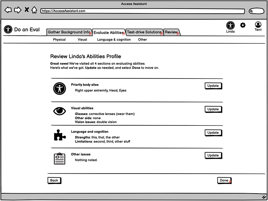
Using Balsamiq prototyping software, we created wireframe designs for workflows that support specific use cases and scenarios. Each wireframe is a digital sketch of one screen (see Fig 1), and multiple wireframes link together to simulate various workflows. The resulting prototypes are a powerful and efficient way to illustrate the basic content and flow without worrying prematurely about styling and implementation.
We iterated the designs multiple times within the team (which includes two clinical experts) to get a starting point to show to practitioners. Four practitioners then provided feedback in a think-aloud protocol [3]. The results provided confidence in our overall direction, as well as almost 100 distinct items for improvements, which we addressed in a revised set of wireframes. At that point, the design was mature enough to warrant a larger, more formal user study to get a second round of feedback, again from actual target users who are AT service providers.
STUDY METHODS
Goals
Our goals were to get detailed feedback on the following aspects of the Access Assistant wireframe prototype: 1) Content of each section and screen - are we covering all the important pieces? 2) Workflow – do the screens and sections connect together in ways that make sense? 3) Usability – are there areas of confusion? Of delight? We wanted to identify ways in which the design works well and ways in which we might be able to improve it.
Wireframe prototypes
Using the Balsamiq wireframing tool, we prepared prototypes for two fictional assessment scenarios, mocked up from start to finish. One scenario involved an AT coordinator at a large suburban school district, working with an elementary student with complex communication needs, with a short-term goal to find a viable switch site that will allow the student to reliably access things like cause-and-effect toys. The second scenario involved an occupational therapist at a rehabilitation hospital, working with a woman with a recent C6 spinal cord injury, to help her access her Windows computer for typical tasks like email and web browsing.
Participants
Participants included 8 AT practitioners who provide assessments and interventions in alternative access for people with severe motor disabilities. There were four occupational therapists, three speech-language pathologists, and a rehabilitation engineer. Four worked in healthcare settings; three in school settings; and one in a community AT center. Two were relatively new to the alternative access field; two with moderate experience; and four highly experienced. None of the participants had seen any of our designs ahead of time.
Procedures
The protocol was approved by an Institutional Review Board and informed written consent was obtained from all participants. We conducted a single one-hour session individually with each participant, via Zoom. Two researchers were present: one to conduct the session, and one to take notes in case of recording failure.
In the main part of the session, a researcher demonstrated one scenario to the participant. Participants selected which of the two scenarios they wanted to see (four participants selected each scenario). Participants were encouraged to talk out loud during the demo, particularly to express points of confusion or specific likes / dislikes.
Feature questions.
After the demo, we asked 11 open-ended feature questions, revisiting specific wireframes to provide context for answering the question. For example, Question B3 was "Looking at the screens related to visual abilities, do you think this approach is a good way of doing it? Or what do you think might meet your needs better?" Feature questions also included an interest rating, phrased as, "Do you want to see [feature / content] in Access Assistant?" Rating options were: 1) No, remove it; 2) I don't need it but it's OK to have it; 3) Yes, it's nice-to-have but not essential; 4) Yes, it's a must have.
Overall ratings.
At the end of the session, we presented 5 Likert-type items, for participants to rate their agreement with statements such as "Overall, Access Assistant seems easy to use." Ratings were 1 to 5 from strongly disagree to strongly agree.
Session transcriptions.
Sessions were encrypted and recorded using Zoom's recording features, then transcribed using Otter.ai which converted audio to text. A researcher checked the auto-converted text for accuracy and edited accordingly in preparation for analysis.
The full detailed procedures, with all the questions, are available for download [4].
Data analysis
Transcription analysis.
The focus was to identify actionable items, i.e., specific feedback we could use to inform revisions to the design (or to justify keeping the design as-is, where warranted). We created a document for each question, containing each participant's verbatim responses to the question. Two researchers then independently highlighted notable segments of each response, particularly looking for points of confusion or concern, specific feedback about how they would or wouldn't use the feature, and ideas for improvements and new features. The resulting highlights (about 200 of them) were entered as cards into a Trello board for thematic analysis, grouped as Trello lists for each question.
We also created Trello cards for each comment participants made during the demo, and added each comment card to a question list if it was relevant to that particular question. For example, if a participant commented on the session report during the demo, separate from their later response to the question about the session report, we included that demo comment in the analysis for the session report question.
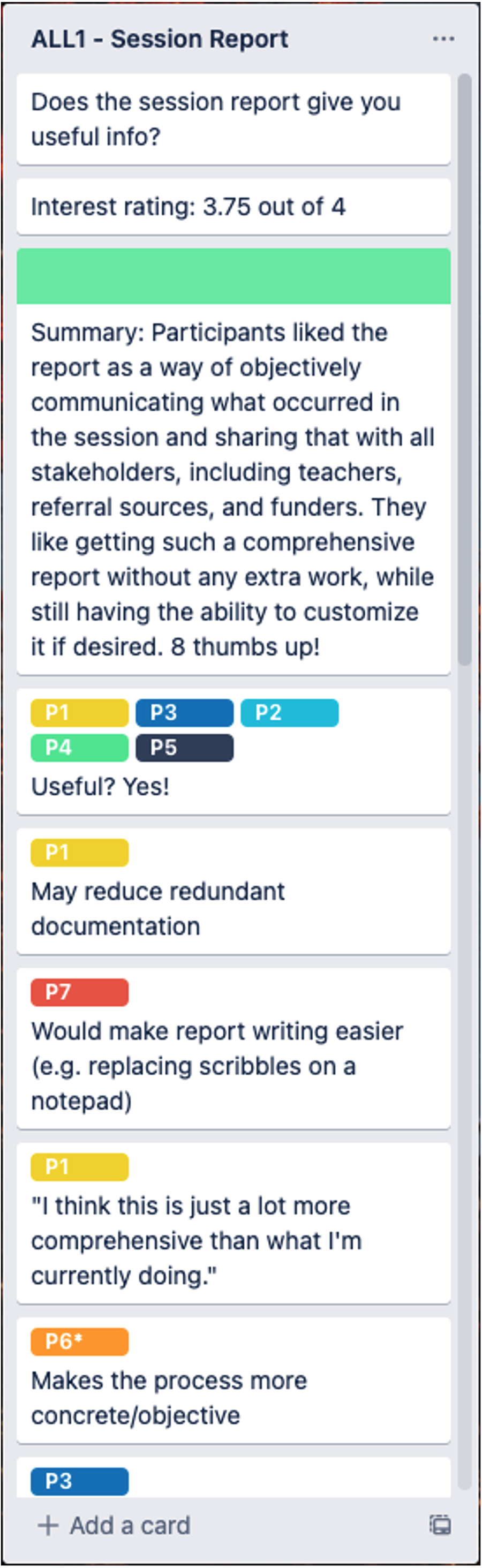
We sorted and organized the cards within the list for each question, then wrote a summary card to put at the top of the list. Thus the Trello board contained lists for all 22 questions, including the response summary and the data supporting the summary. Fig 2 shows a portion of one such list.
Finally, we reviewed all the response cards to create Trello lists representing general themes of Confusions / Concerns, Feature Requests, and Likes (beyond likes already represented in the question lists). If a card in a question list related to one of those three general themes, we copied it and put it in that general theme list.
Ratings analysis.
To analyze the interest and agreement ratings, we entered them into a spreadsheet and averaged them. We also examined the pattern of the interest ratings to get a sense of consensus or wide variation.
Synthesis of the results.
To tie together all of the feedback across each feature question, we created a table with a row for each feature. Columns were the interest rating, any changes needed to the user interface, any related feature requests, and the summary response for that feature from the Trello board. Features were ordered by interest rating, highest at the top. This table is available for download [5].
RESULTS
Specific feature feedback
Six features emerged as participants' "must haves", with an average interest rating of 3.75 or above, out of 4. For example, everyone wanted the app to include both a free-choice activity and a built-in activity as options within the Test-drive section. Three features received ratings between 3.0 and 3.75. The remaining three features had ratings of 3.0 or below (min of 2.5), suggesting that those features may be less important overall to our users.
Feedback from feature questions also indicated where changes were needed to the user interface design, either because participants directly suggested a change or noted confusion regarding some aspect of the feature. For example, related to the vision eval piece in the app, participants agreed that having some sort of vision eval is important and that our current design was a reasonable approach to it. But they also noted additional content that could be included, and modifications that would make it even better.
Additional items that emerged
Outside of specific features that we asked about, participants came up with about a dozen additional items for us to consider. The most significant of these are:
- Add onboarding content to tell users more clearly what Access Assistant is and who it is for.
- Validate and design advanced workflows that allow users to skip questions, resume assessments at a later date, address new goals as old ones are achieved.
- Incorporate seating / positioning content into all sections
- Reduce user uncertainty about how their answers affect the future path / behavior of the app
It's interesting to note that some of these are things we already had on our to-do list (e.g., advanced workflows), but some were not (seating / positioning content).
Overall ratings
Participants agreed (with average ratings above 4.0 out of 5) that Access Assistant seems easy to use, would take an acceptable amount of time, and covers the important pieces of the assessment process. They strongly agreed (average 4.75) that they would use Access Assistant with their clients. Participants also liked the idea of using the app to plan ahead before seeing a client, when time and workflow constraints permit.
DISCUSSION
Implications of these results
These results confirmed that the proposed Access Assistant app meets important user needs, and that our design is on the right track overall. The feedback was encouraging both in general terms (yes, participants would use the app), and for specific features (e.g., having a "Contexts" section is important). Participant responses provided actionable feedback to improve the design, with about two dozen specific enhancements identified. And analyzing responses across participants helped us prioritize what revisions are most important. While it's unlikely that we would remove a feature based solely on interest ratings, a pattern of ratings combined with corroborating verbal feedback does give us an idea of which features are most important, and which ones are less crucial. More importantly, the verbal feedback provided a more specific idea of improvements that could enhance usability.
Value of user-centered design process
Combined with our earlier feedback from 4 practitioners, we've now had 12 practitioners review our design in detail. While we're pleased with the positive feedback, the main purpose of this paper is to demonstrate the value of following a user-centered design process. By involving some users in the early stages of any design project, teams can help ensure that the design and ultimately the product addresses and solves real user needs. The specific procedures can be adapted to follow a user-centered process regardless of project timeline or budget.
Future work
We're revising the design in accordance with these results, and have started implementing the app in software, using ReactJS. We'll then conduct a clinical evaluation of the app to determine its usability and effectiveness in real-world use. Ultimately, the Access Assistant app will be freely available on the web to all.
REFERENCES
[1] Klasna P. UX Design: From concept to prototype [Internet]. [retrieved Aug 2020]. Available from: https://www.coursera.org/learn/ux-design-concept-wireframe.
[2] Koester H, Fager S, Jakobs E, Sorenson T. (2021). Designing an app for computer access assessments: using interviews to uncover and define user needs. Proc of RESNA 2021 Annual Conference, Arlington VA.
[3] Nielsen J. Thinking aloud: the #1 usability tool [Internet]. [retrieved Feb 2022]. Available from: https://www.nngroup.com/articles/thinking-aloud-the-1-usability-tool/
ACKNOWLEDGEMENTS
Many thanks to our participants for their time and insights. This research was supported by a grant from the National Institute on Disability, Independent Living, and Rehabilitation Research (NIDILRR grant #90REGE0014) to the Rehabilitation Engineering Research Center on Augmentative and Alternative Communication. NIDILRR is a Center within the Administration for Community Living, Department of Health and Human Services.