Alexandra M. Delazio![]() 1
1![]() , David M. Brienza
, David M. Brienza![]() 1,2,3
1,2,3![]() , Amanda Manko
, Amanda Manko![]() 1
1![]() , Patricia E. Karg
, Patricia E. Karg![]() 1
1![]()
![]() 1
1![]() University of Pittsburgh, Department of Rehabilitation Science and Technology,
University of Pittsburgh, Department of Rehabilitation Science and Technology, ![]() 2
2![]() University of Pittsburgh, Department of Bioengineering
University of Pittsburgh, Department of Bioengineering ![]() 3
3![]() McGowan Institute for Regenerative Medicine
McGowan Institute for Regenerative Medicine
INTRODUCTION
Implementing standardized wheelchair cushion performance test results can benefit wheelchair users, healthcare professionals and manufacturers each in unique ways. If clearly understood and communicated, outcomes from these tests can encourage and allow healthcare providers to compare and contrast products. With the same information, wheelchair users can be empowered to work closely with their healthcare providers to explore which cushion most closely meets their individual needs. Manufacturers can utilize standardized performance outcomes to back marketing claims about cushion performance and improve product quality. Primarily due to the lack of tools to help visualize and interpret the outcomes.
To date, the International Organization for Standardization (ISO) and nationally adopted RESNA seating standards provide observed ranges of results for performance outcomes along with brief (1-2 sentence) guidance on how to interpret the results [1][3]. The University of Pittsburgh's NIDILRR funded Rehabilitation Engineering Research Center (RERC) on wheelchair standards has published an extended guidance document which provides additional information on the procedure for each test in addition to interpretation notes [2]. anufacturers seeking to benchmark their products against competitors nor for users faced with choosing between multiple cushions because cushions' performance within the ranges are not equally distributed. Nor is knowing the absolute value of test results sufficient for predicting clinical outcomes because these relationships are generally not known. The current state of knowledge about what cushion performance is likely to satisfy particular clinical needs is such that multiple performance characteristics need to be weighed and balanced in a qualitative manner to arrive at the best solution believed to have a positive impact on health and function outcomes. This type of interpretation is difficult without visualization tools to assist with the process.
Herein, the benefits of a novel wheelchair cushion performance data visualization tool to effectively interpret and communicate performance outcomes will be described. The data shown are from a 21-cushion cohort consisting of cushions varying in construct, material and CMS code that underwent several rounds of characterization and simulated aging as defined by the RESNA and ISO seat cushion standards [1,3-4].
METHODOLOGY
A cohort of 21 wheelchair cushions varying in construct, material and code were characterized using a series of eight performance tests as outlined in the standards and shown in Table 1.
Performance Test Name |
ISO/RESNA Designation |
Performance Test Name |
ISO Designation |
Loaded Contour Depth and Overload Deflection |
ISO 16840-2:2018 Clause 11 |
Hysteresis |
ISO 16840-2:2018 Clause 14 |
Envelopment |
ISO 16840-12:2015 |
Impact Damping |
ISO 16840-2:2018 Clause 9 |
Pressure Mapping |
ISO 16840-6:2015 Clause 14 |
Horizontal Stiffness |
ISO 16840-2:2018 Annex C |
10% Force Deflection |
ISO 16840-6:2015 Clause 20 |
Sliding Resistance |
ISO 16840-2:2018 Annex C |
Cushions were then aged using the minimum set of simulated aging procedures outlined in RESNA WC-3, Section 6 - Determination of the changes in properties following simulated extended use of seat cushions [3]. This minimum aging protocol was performed in the following order: disinfection, laundering, accelerated heated aging for half the indicated time period, cyclic loading, accelerated aging for half the indicated time period, a second round of disinfection and finally laundering. This protocol represents the minimum challenges a cushion experiences with use and simulates approximately 18-24 months of real-world use. The protocol was performed twice on each cushion. Before and after the aging protocols, cushions were characterized using the aforementioned eight performance tests allowing for data comparisons to be made at three time points: 1) "pre-aging", 2) "post-aging 1" and 3) "post-aging 2."
A series of data processing algorithms were used to create a graphical interface in MATLAB (The Math Works, Inc., Natick, MA) that allows for the visualization of performance test outcomes for the entire cushion cohort. When prompted, users of the system specify cushions of interest to be highlighted among the 21-cushion cohort. Users can visualize the cushions' performance data among the data for the entire cohort. The system is capable of producing graphs for all performance tests at the three time points of data collection: 1) "pre-aging", 2) "post-aging 1" and 3) "post-aging 2."
RESULTS
Three examples of data visualization will be described to demonstrate the utility and capability of our data interpretation tool. In each example, various cushions are highlighted within the results from the 21-cushion cohort tested. The maximum and minimum test results for all data visualized are consistent with the maximum and minimum range values specified in the standards [1][3].
Example 1: Loaded Contour Depth and Overload Deflection Data Visualization
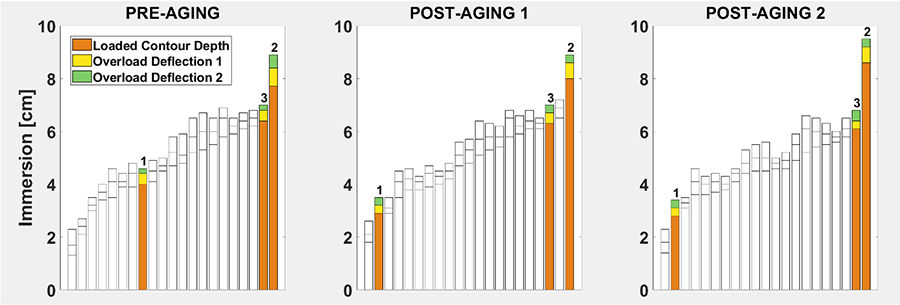
In the first example, we examine differences in immersion performance between three cushions within the results from the 21-cushion cohort tested. Loaded Contour Depth and Overload Deflection examines the cushion's ability to allow user's buttocks to sink (immerse) into the cushion. This test produces three key outcomes: Loaded Contour Depth (the depth in centimeters of immersion of the basepoints (ischial tuberosities) of the cushion loading indenter under a nominal load of 135N after 300 seconds), Overload Deflection 1 (the additional depth of immersion beyond Loaded Contour Depth in centimeters with a 33% increase in load from the nominal load) and Overload Deflection 2 (the additional depth of immersion beyond Loaded Contour Depth in centimeters with a 66% increase in load from nominal load) [2]. Results from this test are shown in Figure 1 as displayed using our visualization tool.
The three cushions highlighted above exhibit different depths of immersion relative to one another across all three time points. CUSHION 1 consistently exhibits the least immersion while CUSHION 2 consistently exhibits the most immersion. A higher Loaded Contour Depth can indicate more immersion into the cushion and greater distribution of pressure on the soft tissue. This data visualization allows for an examination of how CUSHION 1's overall immersion decreases after just one round of simulated aging. By noticing that CUSHION 1's performance shifts leftward, an interpretation can be readily made that its decrease in immersion after the first round of simulated aging was more profound than the other cushions. A person considering CUSHION 1 may not choose this model if they are concerned with maintaining immersion performance over a long period of time. The manufacturer may modify the cushion design to try to improve this outcome.
Example 2: Impact Damping Data Visualization
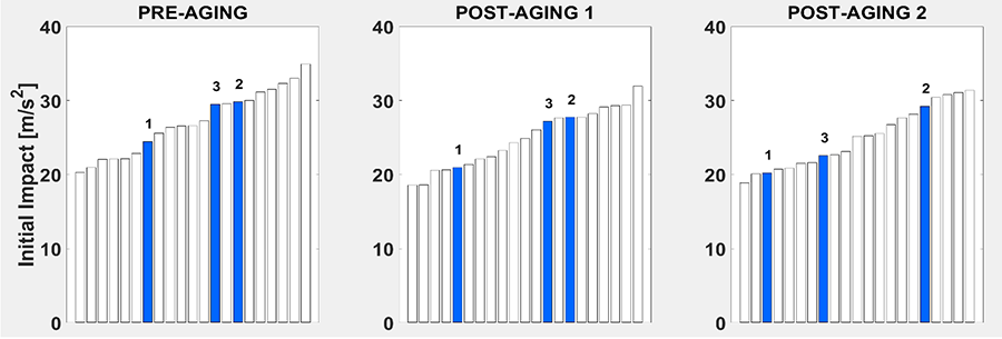 Figure 2. Pre-aging (left), post-aging 1 (middle) and post-aging 2 (right) Initial Impact acceleration results (blue) in m/s2 for three cushions highlighted among the results for the 21-cushion cohort tested.
 In the second example, we examine differences in Impact Damping performance between three cushions within the results from the 21-cushion cohort tested. Impact Damping is a performance test that examines the cushion's ability to reduce impact loading on tissues when performing tasks such as going off a curb or down a step with a wheelchair [1]. One of the key results from the Impact Damping test is the magnitude of acceleration (m/s2) of the initial impact of a cushion loading indenter on the cushion. The Initial Impact acceleration results are shown in Figure 2 across all three time points.
CUSHION 1 consistently exhibits the lowest acceleration at initial impact across all three time points and decreases after just one round of simulated aging. A lower initial impact acceleration can indicate better comfort and postural stability with impact events. CUSHIONS 2 and 3 exhibit similar initial impact accelerations higher than that of CUSHION 1 consistently across the first two time points. During pre-aging and post-aging 1, it appears that CUSHIONS 2 and 3 are "clustered" (i.e., perform similar to one another compared to CUSHION 1). For a "cluster", cushion performance could be categorized as similar for this particular cushion characteristic. After a second round of simulated aging, CUSHION 3's performance improves (i.e., impact acceleration decreases) similar to several other cushions in the 21-cushion cohort, while CUSHION 2's performance remains constant. It could be said that after prolonged use CUSHION 3 now appears to be "clustered" with CUSHION 1. A more definitive statement could be made if the minimum detectable difference was known for this test result. Ultimately, a person considering CUSHION 2 may not choose this model if they are concerned with maintaining postural stability with reduced bouncing when a bump/curb is encountered.
Example 3: 10% Force Deflection Data Visualization
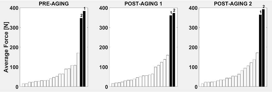
In the third and final example, we examine the performance of two cushions for the 10% Force Deflection test relative to the results from the 21-cushion cohort tested. The 10% Force Deflection test evaluates a cushion's ability to "cushion" or elastically deform by measuring the average force necessary to produce a deflection of 10% of the cushion thickness [3]. The average force results are shown in Figure 3 across all three time points using our visualization tool.
CUSHIONS 1 and 2 are "clustered" together with average force magnitudes triple the size of all other cushions in the 21-cushion cohort. CUSHIONS 1 and 2 show no change in stiffness over the course of two rounds of simulated aging. Using this visualization, a person seeking a firm cushion that can withstand the test of time can quickly and easily identify CUSHIONS 1 and 2 whose performances visually tower over the other cushions' results.
DISCUSSION
Wheelchair cushion performance standards are a valuable asset to wheelchair users, healthcare providers and manufacturers. Without providing these stakeholders with a concrete, understandable conveyance of the results produced by the standards, this value is not realized. Clear communication of the results of the standardized tests is key to enlightening and empowering these stakeholders. The data visualization presented in this paper provides the foundation for breaking down this communication barrier and inviting key stakeholders to utilize the standards to improve the health and well-being of wheelchair users and advance product quality.
All interpretations in the examples above were made irrespective of the numerical values of the results, thus "clinical" decisions can be made using visual representation of relative performance of a variety of cushions without the full understanding of the relevance of the numerical values, which may or may not be known based on the state of health outcomes research in the field. Moving forward additional steps will be taken to expand this data visualization tool to develop algorithms to visualize multiple metrics simultaneously. This strategy levels the metaphorical "playing field", allowing those with less knowledge of the standardized tests to benefit from the information provided.
REFERENCES
- International Organization for Standardization (2018). ISO 16840-2: Wheelchair seating. Geneva, Switzerland.
- University of Pittsburgh Rehabilitation Engineering Research Center. (2020). Interpreting wheelchair seat cushion performance standards...A guidance on how to interpret performance measures obtained from ANSI/RESNA WC-3 and ISO16840 Wheelchair Seating standards for wheelchair seat cushions intended to manage tissue integrity. [Fact Sheet]www.wheelchairstandards.pitt.edu
- RESNA (2018). RESNA American National Standard for Wheelchairs - Volume 3: Wheelchair Seating. Rehabilitation Engineering and Assistive Technology Society of North America. Arlington, VA.
- International Organization for Standardization (2018). ISO 16840-12: Wheelchair seating. Geneva, Switzerland.
ACKNOWLEDGEMENTS
The contents were developed under a grant from the National Institute on Disability, Independent Living, and Rehabilitation Research (NIDILRR grant number 90REGE0001). NIDILRR is a Center within the Administration for Community Living (ACL), Department of Health and Human Services (HHS). The contents do not necessarily represent the policy of NIDILRR, ACL, or HHS, and you should not assume endorsement by the Federal Government.